What is CannaMates?
CannaMates is a web and mobile application that enables anyone, anywhere to instantly network, chat, and build community with experts in the legal cannabis industry. The platform connects industry leaders with people who want to get their foot in the door — but don't know where to start or who to trust.
Create a platform that allows individuals to connect with cannabis industry experts through a safe and secure portal for mentorship, industry insights, and opportunities. Success is measured when new users sign up to meet with experts using the platform.
Inspiration
This project was born from personal experience trying to break into the cannabis industry — being overwhelmed by unreliable information and not knowing who to trust in an emerging, rapidly-changing space. Like Wall Street shutting out newcomers, underrepresented communities were being excluded. CannaMates was designed as a trusted space where information is factual and of real value.
The challenge
Cannabis enthusiasts need a way to connect with industry leaders because they are looking for reliable information and networks to have a greater chance of finding their niche in the emerging industry.
Possible solutions explored
- Tinder-style matching — swipe left or right to meet people within your needs range
- Facebook/Reddit-style forums — find each other through discussion channels
- LinkedIn/Clubhouse hybrid — join panels, then book meetings with expert panelists (chosen direction)
Competitive analysis
Two competitors were analyzed using SWOT frameworks to identify gaps and opportunities.
getmeexperts.com
Strengths
- Strong pool of experts across industries
- LinkedIn sign-in available
- Tutorial videos and clear call to action
Opportunities
- No cannabis-specific focus — room to differentiate
- UI improvements needed
- No post-signup onboarding
Weaknesses
- Broken drop-down menus
- Pricing not shown for experts
- Last blog post from 2017
Threats
- Cybersecurity concerns — weak password requirements
- Expert visibility may invite competitor poaching
Growers Network
Strengths
- Rich cannabis-specific content and video tutorials
- Descriptive, focused blog
Opportunities
- Multiple sign-up options
- Add onboarding and forum organization
Weaknesses
- No "About Us" page
- Forums not organized by topic
Threats
- Growing community organically is difficult
- Low member participation
Listening to all three stakeholders
I conducted user interviews with mentees, mentors, and program administrators — each group had distinct needs that shaped the platform's feature set.
Mentors said…
- Need written guidelines for connecting with mentees
- Want tips and best practices in-app
Administrators said…
- Need to record member data
- Want discussion groups and engagement analytics
Mentees said…
- Want general resources and inspiration
- Need a direct way to message mentors in-app
All users agreed on…
- A centralized resource hub (worksheets, job boards)
- Transparent onboarding to build trust
Affinity mapping insights
- Brand: Publicly laying out the who, what, when, where, and why builds trust and recruits the right fit.
- Community: A human-reviewed application/questionnaire ensures quality matches and serious participants.
- Onboarding: Critical to long-term success — lay the ground rules, navigate the platform, and build confidence.
- Pain Points: Drop-off is real. Transparent processes for transitions keep the community healthy.
Who we're designing for
6 years in cannabis, working her way from trimming to director. Wants to help other women and people of color find their path in the industry.
- Googles cannabis opportunities, finds CannaMates, creates an account
- Begins mentor application; can save and return later
- Selects interview time via Calendly; downloads calendar invite
Emotions: Curious → Anxious & motivated → Excited & thoughtful
Previously incarcerated due to a cannabis possession felony, now reentering society. Discovered CannaMates on Instagram and sees it as a way to grow his career.
- Finds CannaMates via social media algorithm, reviews the program
- Creates account, reviews application, submits on his own time
- Receives confirmation email, selects interview slot, syncs calendar
Emotions: Curious → Anxious & motivated → Excited
Mapping the journey
Two primary user flows were mapped in detail to ensure critical paths were smooth and unambiguous.
Card sorting & site map
A card sorting exercise with 5 participants shaped the final navigation structure. The biggest insight: the original user dashboard was hiding features that users specifically joined for — so sub-categories were expanded.
| Feature | Mentor | Mentee | Community | Login |
|---|---|---|---|---|
| Apply | 60% | 40% | — | — |
| Messages | — | 60% | — | 40% |
| Articles | 20% | — | 80% | — |
| In-person Events | — | — | 80% | 20% |
| Notifications | — | — | — | 100% |
| Settings | — | — | 20% | 80% |
Final site map — 5 main sections
Mentor
- Apply
- Meet Mentees
- Why Apply?
- Support
- Common Questions
Mentee
- Apply
- Meet Mentors
- Opportunities
- Common Questions
Community
- Virtual Events
- In-Person Events
- Articles
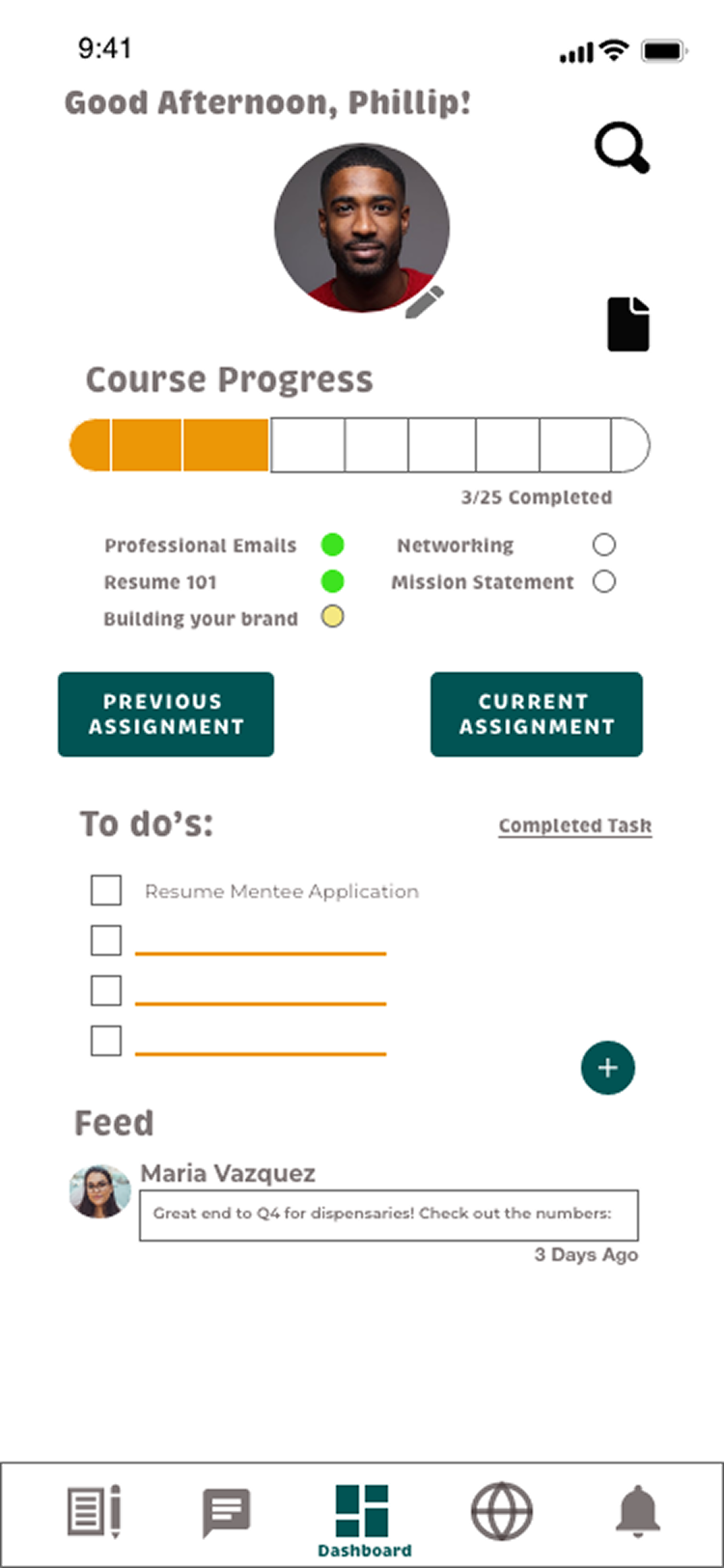
User Dashboard
- Notifications
- Messages
- Notes
- Settings
- Support
From sketches to hi-fi
The design evolved through three fidelity levels — each round of testing directly shaped the next iteration.
Low Fidelity
Paper sketches and basic wireframes. Established core navigation patterns, homepage structure, and the mentor/mentee dashboard layout.
Mid Fidelity
Grayscale digital prototypes in Adobe XD. Added real content, interaction flows, search, messaging, and the onboarding tutorial.
Preference Testing
Tested 2 onboarding screens with 10 participants. Option B won 6/10 — users preferred its focused, concise layout with less background distraction.
High Fidelity
Full color, branded screens incorporating all usability testing feedback. WCAG-compliant contrast, refined button states, and a polished component system.
Testing with real users
Six participants completed moderated remote sessions via Zoom. Test goals: sign up, begin a mentee application, and review/grade a mentee assignment.
Error prioritization — Nielsen's scale
Key issues & resolutions
Problem: Volunteers couldn't find where to sign in or sign up. They clicked the burger menu, search bar, and newsletter field instead of the "Join" button.
Solution: Relabeled "Join" to "Sign Up/In" to clarify intent. Newsletter sign-up converted to a drop-down to reduce visual clutter.
Problem: Users tapped "Begin Mentee Application" on the onboarding tutorial, unaware it was a static image — not an active button. They didn't realize they were in a tutorial until slide 2 or 3.
Solution: Added a "Tutorial" heading label to all onboarding slides. Created an option screen to choose between viewing features or going straight to the dashboard.
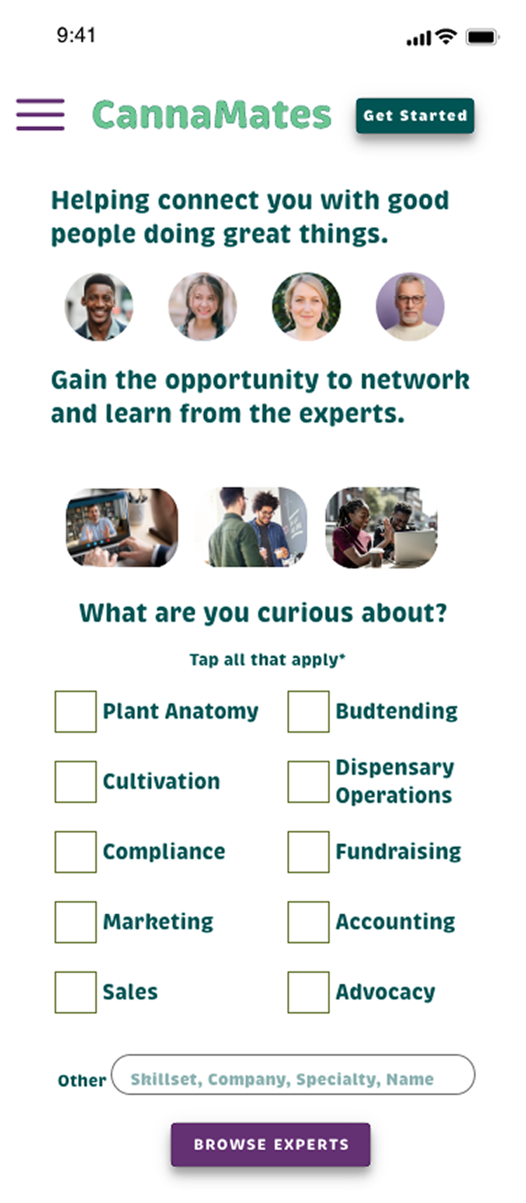
Problem: Users got stuck on the interest-selection page because the prototype required choosing more than one option, but nothing indicated this was possible.
Solution: Added "Select all that apply*" instructional copy directly beneath the question prompt.
Problem: A swipe gesture icon on mentor profile cards led users to swipe — but Adobe XD only supported tap. Users couldn't view additional profiles.
Solution: Replaced swipe icon with a tap icon to match the prototype's actual behavior.
What users said
Theory behind the decisions
Visual Hierarchy
Brand name in large yellow; subtext in smaller green. The CTA matches brand weight — orange action button signals the final step.
Law of Proximity
"What" and "why" context grouped together. CTA placed at the bottom alongside related actions.
Law of Continuation
F-pattern eye tracking applied — text and buttons flow vertically, then horizontally for smooth navigation.
Law of Closure
"Sign Up/In" button uses an unclosed slant to signal there are more options waiting when tapped.
Law of Similarity
Account feature icons are uniform in size and color — communicating they all belong to the same feature set.
Balance & Emphasis
Tutorial features arranged in a circle — no hierarchy among them. "Features in Account" highlighted in blue to drive the primary action.
Before & after testing
Every screen went through at least one round of feedback-driven iteration. Here are the most impactful changes.
Homescreen
- Before: "Join" button was boxy with a border; blue body text was too large; hashtag bubbles were noisy; three-column interest list used text that was too small to read.
- After: Button renamed and restyled for consistency. Interest list moved to two columns with larger text. Homepage made scrollable.
Onboarding tutorial
- Before: "Tutorial" heading had too much white space; oval border was distracting; nav bar visible during tutorial pulled focus away.
- After: Title aligned with back arrow. Border made thinner (users liked the card aesthetic). Nav bar removed during onboarding.
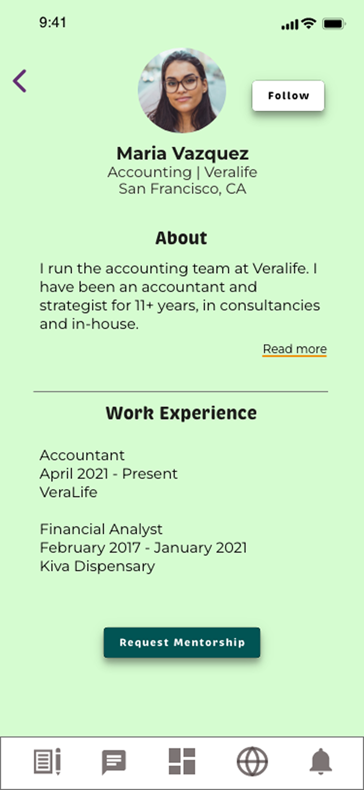
Mentor profiles
- Before: Outlined buttons; checkmark icon after follow was ambiguous; "Request Mentorship" button at the top meant users hadn't read the profile first.
- After: Buttons filled as solid CTAs. "Followed" text with color change replaces checkmark. "Request Mentorship" moved to bottom of profile.
Task review screen
- Before: Black text on green callout bubble was difficult to read.
- After: Background changed to white; callout changed to yellow. Feedback options restyled as buttons to signal they're interactive.
What comes next
By creating a low-stakes "explore" mode — where users can browse profiles and cannabis content without committing to the full mentorship program — we lower the barrier to entry and drive profile completion over time. Success: 80–100% profile completion rate and increased engagement on content posts.
10-week implementation timeline
What I learned
This project deepened my understanding of the full UX design process — from stakeholder discovery through high-fidelity iteration. The most important lesson: less is more. Designing with simplicity and intention creates a better product than loading a screen with features. Small, well-placed microcopy can completely unblock a user. And user testing is the fastest path to clarity.
- Clear instructional microcopy prevents the most common user errors
- Prototype fidelity can mask or create usability problems — always test interactions
- Three very different user types (admin, mentor, mentee) require intentional separation of concerns in IA
- Community-building features are as important as core functionality for retention